IBM Blue Studio ebook template
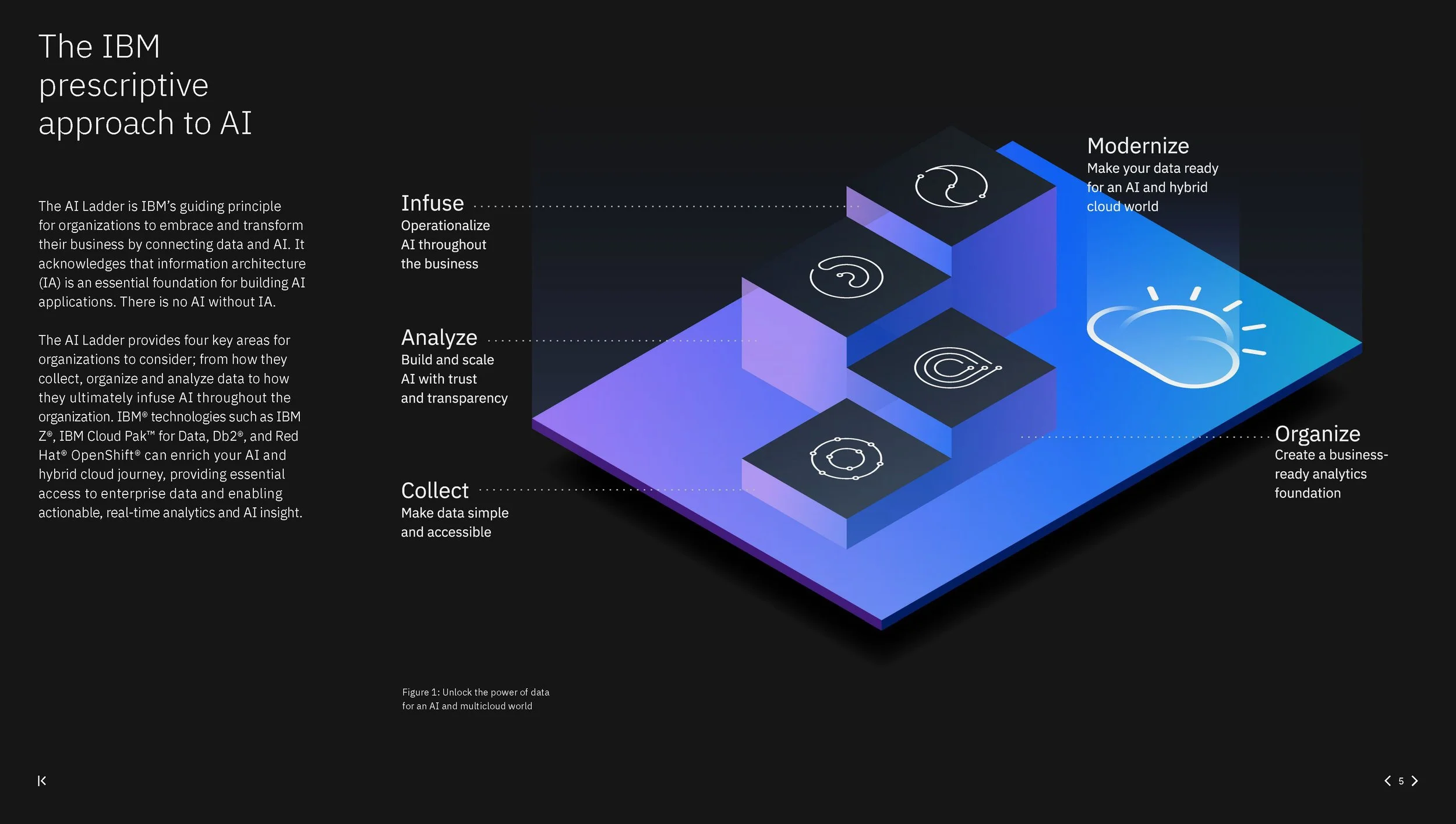
In the spring of 2020, we started receiving an influx of ebook requests from our clients. To ensure we were able to respond to these requests quickly while still maintaining a consistent look and feel, I led the creation of an organization-wide ebook template.
Over the next few months I conducted numerous reviews with the other designers and broader leadership team, fine-tuning along with way. I’m currently working with the corporate branding team to scale the template across all of IBM.
Getting started
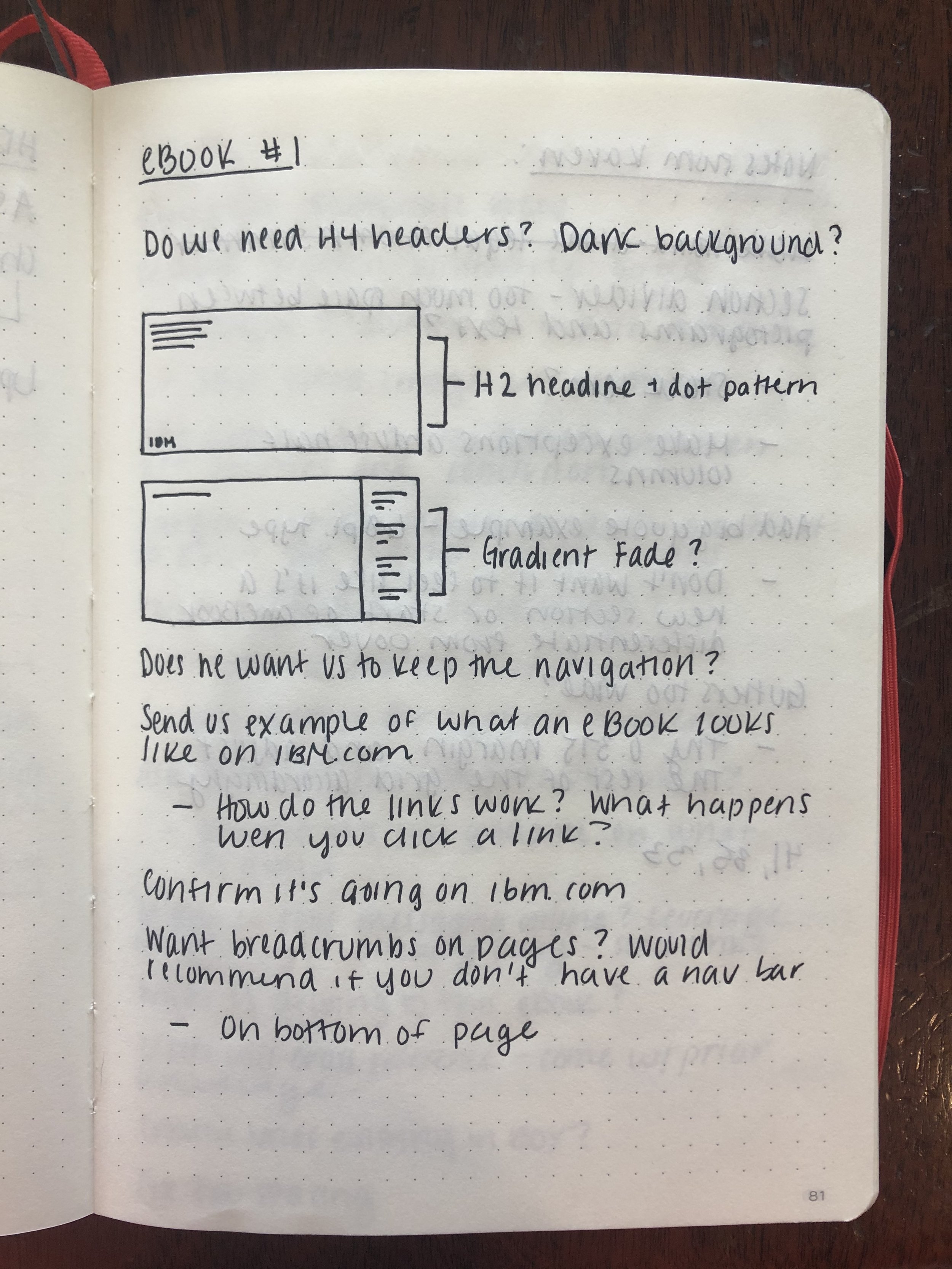
Early on, I met frequently with the rest of the team to discuss what features they would like to see included in the template and to identify pain points they’d like to have addressed.
These included adding a baseline grid, simplified navigation with a clearer UX/UI, a wider range of page layout options, a clear type hierarchy that falls perfectly on the baseline grid, easy to use paragraph and character styles, and guidelines on adding accessibility.
Learning from others
I also conducted a survey of past ebooks–both those created for our team and those created by others–to draw inspiration and identify common themes. These included splitting the page, allowing for full-bleed and inset images, heavy text layouts, and navigation.
Building the grid
Once I had a firm understanding of common themes and pain points, I created sample layouts and worked out the column and baseline grids. I had to divide 8 columns evenly across the page, and make sure the gutters were able to be split in half. Type sizes and leading also had to be calculated so that everything fell perfectly on the baseline grid.
This process required a lot of trial and error (and wishing I’d paid more attention in math class), but eventually I landed on a 7pt mini unit. This size fit evenly across the document horizontally and vertically, distributed 8 equal columns across the document, and allowed for gutters double the size of the outer margins.
Putting it to use
Once I had a strong first draft of the template completed, we began using it as a team–continuing to make updates along the way. Though it was originally intended for use by my immediate team, it eventually became the standard ebook template for the entire organization.
I’m currently working with my art director and the brand team to review the document, which includes adding additional navigation options, simplifying the sample layouts, detailing instructions on use, etc… Once this step is finished, it will become the standard ebook template at IBM.


